Symbol Mark
MIGA symbol represents its role and mission as a leading icon of eco-friendly housing. MIGA gives comfortable & calm feeling by natural color of glove. Plus, acronym of MIGA which is combination of four syllable implicit interior, embrace one house and composi- tion of a village. Ultimately, the symbol embody 'smiled one', main value of MIGA.
Members of MIGA are active, comfortable, and full of vitality and make positive changes. Homely style and warm tone of its colors are clothes, MIGA family wear on. Our symbol is a wheel, a wheel create business opportunities, value-added enterprising field and peaceful community solidarity. Furthermore the wheel contains endless innovation with harmony and collaboration.
Logo Type
-
Symbol Mark
-
Logo Types
-
Super Graphics
-
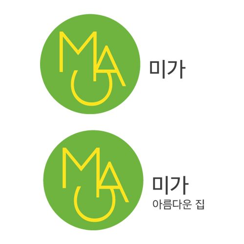
Signatures
Color System
-

- CMYK :
- 59, 0, 100, 7
- RGB :
- 108, 179, 62
- #6cb33e
Green
Green circular arc represent rhythm, nature, circulation of life, easiness. We follow the order of nature, to support people continue comfortable and beautiful way of going. In addition, we try to create changes that we can trust in which designed by eco-friendly items, not to give harmful damage on our earth.
-

- CMYK :
- 0, 5, 197, 0
- RGB :
- 255, 232, 0
- #ffe800
Yellow
Color of yellow is suggestive of fresh, young and warm-hearted icon, MIGA. Positive image of the color make people easy to associate MIGA with more beautiful and restfulness feelings. Attached meanings of color yellow helps customer being familiar with MIGA items by its nature, leads to happiness.
